True Colours exhibits in our shared Ege Carpets / Gabriel showrooms in Stockholm, Oslo and Copenhagen. Reach out now to book your guided tour.
Curated by Cenk Kivrikoglu, textile designer and creative director at Gabriel
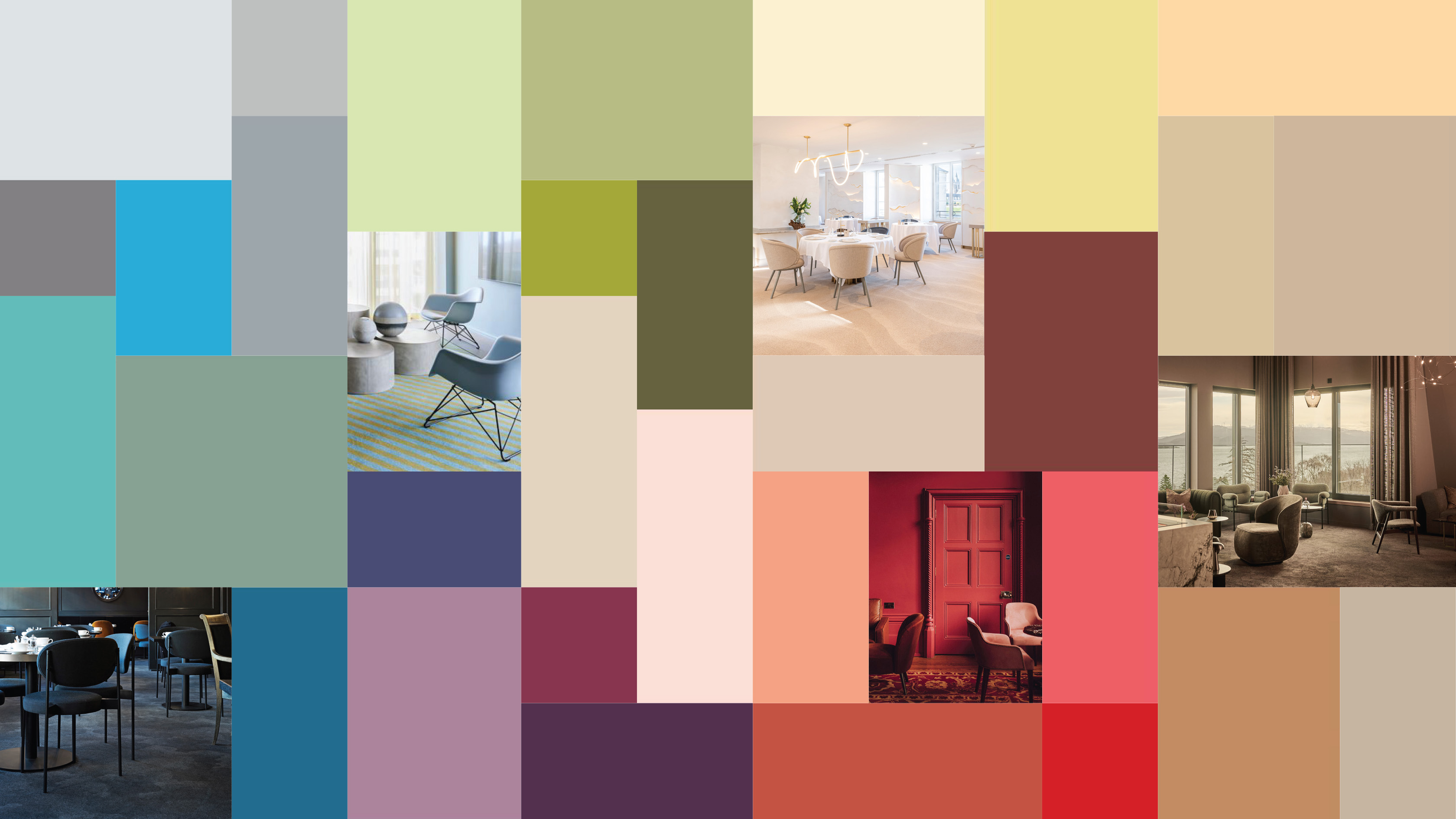
Welcome to an exploration of the amazing abilities and influences of colours in interior design. Colours are the emotional elements of a structure that affect our senses and emotions; do we feel safe, nurtured or energised? Colours are in constant motion and will change in their interaction with light, other colours and materials. Some will harmonise just like friends. Others stand out and create a new energy. The full sensory perception of colours is always contextual and combined with our personal experiences; how we feel, how we relate. We might not know exactly what it is, but it lives within us.
Curated by Cenk Kivrikoglu, textile designer and creative director at Gabriel, True Colours explores three dimensions of colours: from the inspiration of minerals from the soil and the natural pigments of tinctorial plants to the application of colours in the creation of different moods to the actual fabrication methods of textile colours.
This article explores three dimensions of colours: colour inspiration, colour application and colour fabrication. Thus, we’ll take you behind the scenes of contemporary interior design to show how to exploit the abilities and influences of colours in your own projects.
Many colours are inspired by nature because natural hues are eternally relevant. Sensitive and healing, these colours give us a feeling of belonging and timeless stability while urging us to discover more. Tinctorial plants and minerals have several layers in their colour presentation as if they have more to say than what meets the eye at first sight. And by applying the colour hierarchy of nature, we learn not to look at colours individually but always in the context of other hues, materials and light.
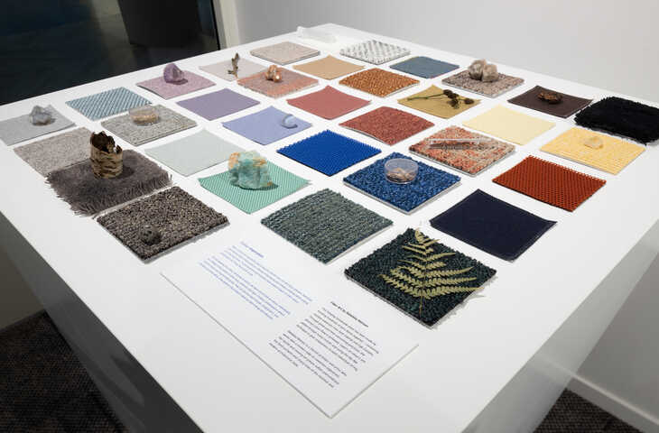
This results in endless combinations where colours relate and respond differently: they can be close friends almost alike, complementary in ways that make them elevate each other or dynamic diva colours that stand out with energy and vibrancy.

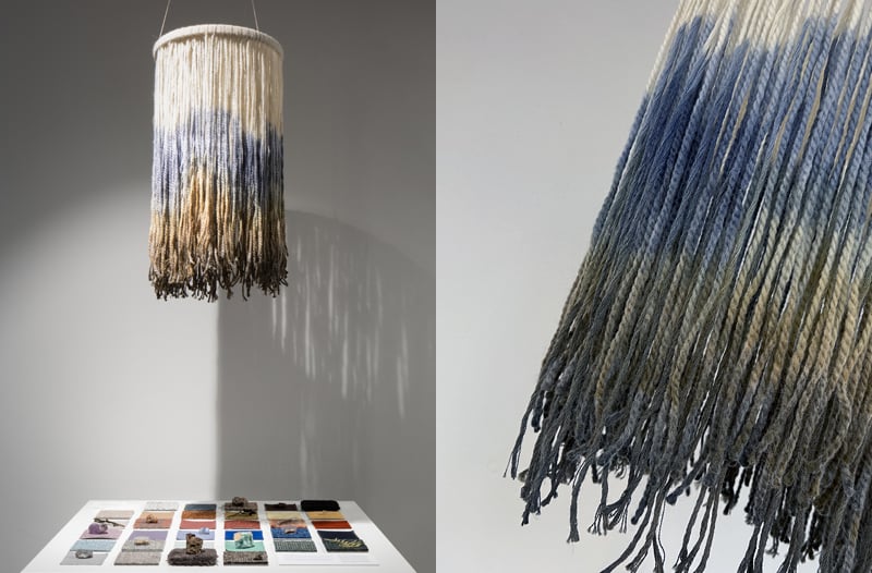
This hanging handmade piece has been made by knotting hundreds of yarn fibres together, combining residue materials from both Gabriel and Ege Carpets. Through great and time-consuming precision, the desired colour flow is achieved. Layers of colours are added through the dip dye technique, using many rounds to add colour uniqueness to each individual string.
This item is made by Rebekka Nielsen, a Danish architect and artist who works with a modern take on seventies tapestries. Her tactile and moving art pieces soften and embrace the hard surfaces and sharp lines of the minimal and contemporary architectural style.
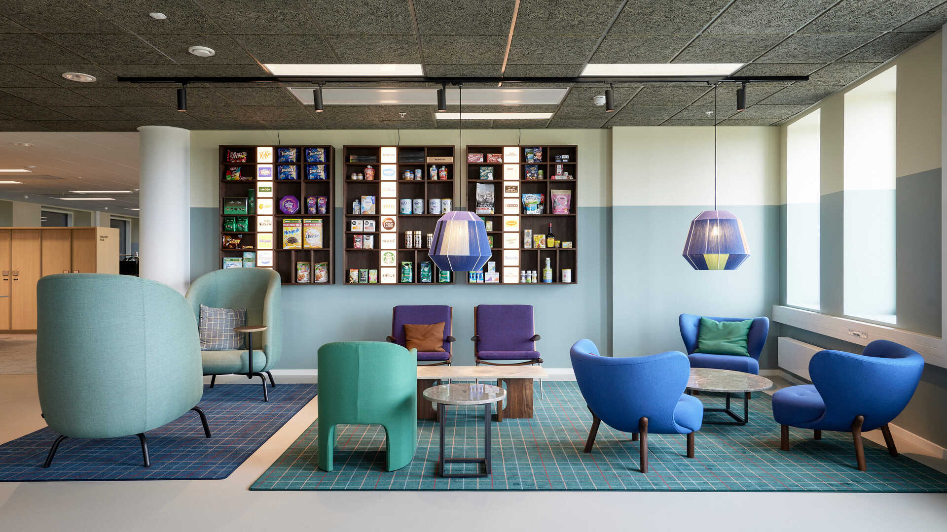
Colours are the language of the senses and some say that we feel with our eyes and see with our hands. Explore four artistic interpretations of moods and atmospheres using colour, form and material below.
Through colours, we can stimulate energies and create atmosphere: what’s the intention of the colours used in a spatial context? Are we striving to create an ambience of energy or an ambience of comfort?
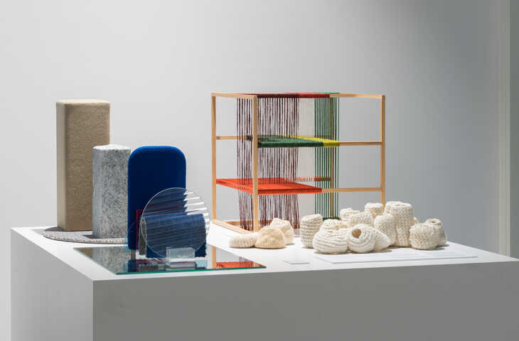
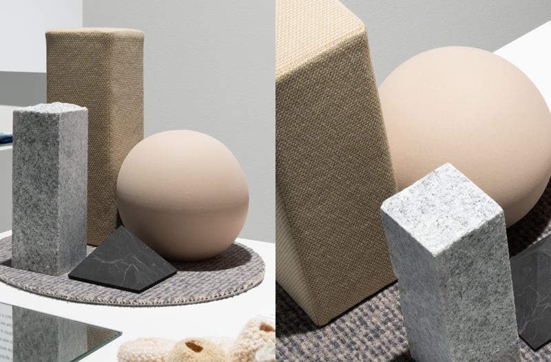
Familiar geometric constructions in stone materials and earthy tones that give you a sense of stability, reliability and security. Visualised through items such as:
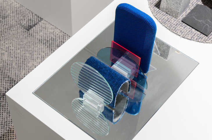
A fictional futuristic and techy environment that invites you to explore new perspectives and directions with shiny and neon-coloured surfaces. Visualised through:
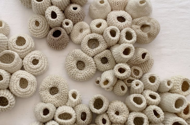
The yarn used in this artwork is 100% recycled and consists of leftovers from the production at Ege Carpets and Gabriel. The corals are made with crochet techniques.
Using only natural dyes from plants such as fig leaves, spruce and hibiscus petals, the healing effects of nature are translated into a space where we can hide and feel safe. Here, the tactility of good materials, traditional craftmanship and the most delicate natural colours embrace and nurture us.
This piece is made by textile artist and founder of Hvileloes, Trine Kok, who is uncompromising when transforming scraps perceived as “nothing” into “something”. Her passion is to help promote people’s wellbeing through eco-optimised and worthy workplaces.
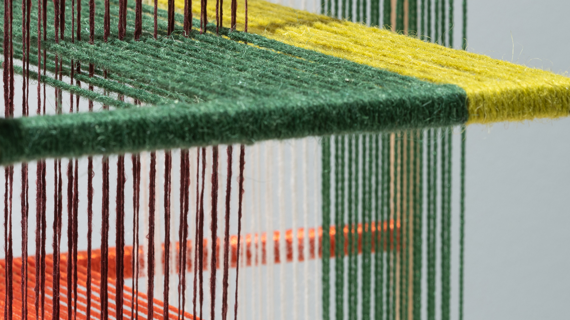
The idea was created during the process of using a quick sketch tool that’s commonly used by weavers when they choose yarn and colours for their compositions. Winding yarn is a method that opens for new inspiration and is an almost meditative activity.
The yarns consist of natural and synthetic fibres. Some are thick wool, others thin polyamide. Some colours are intense, others more soft tones in different textures such as fluffy, coarse, fine, shiny or matte. The diversity of the yarn contributes to the energy and vibrancy of the installation, which is the result of two-dimensional warp tests that are translated into a three-dimensional warp installation on a thin skeleton made from pine tree. A choice of material with a clear link to the traditional old-school floor loom.
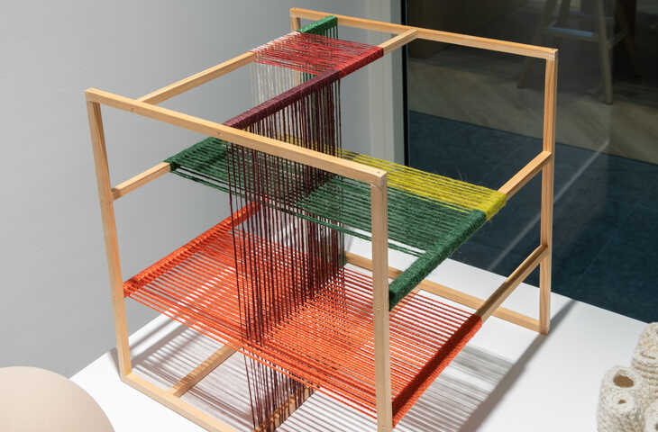
With reference to traditional weaving, textile designer Signe Fink Nørgaard has used the combination of weft and warp threads to create this dynamic installation. The repetitive and rhythmic process of warping a loom opens for new inspiration as yarn and colours mix and create new colours.
It’s not only colours, but the diversity of yarn fibres in material and thickness that creates a new energy. The simple crossing of different shades and textures in a three-dimensional space has an amazing power with exciting blends, gaps, light effects and shadows. New compositions appear from different angles and continue to feed and lift you.

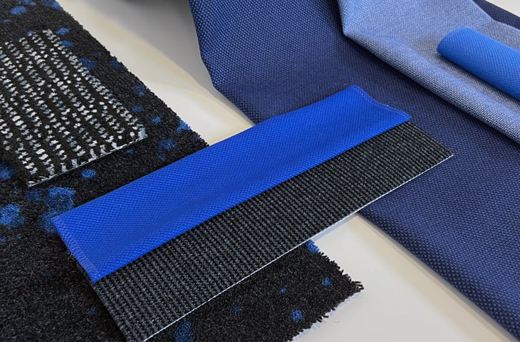
Colour is a vital ingredient in textiles and carpets. Thanks to modern technology, the processes available for dyeing have broadened over time, allowing for greater design versatility. Whether you want unicolours, mélanges or large-scale patterns, different processes can be used depending on the desired result and choice of material. Here are three of the most common methods:
Want to experience our True Colours exhibition with your own eyes and hands? In our Stockholm, Oslo and Copenhagen showrooms, you’re always welcome to dig further into the amazing abilities and influences of colours in interior design and we’re more than happy to give you a guided tour. So, don’t hold back if you’re striving to develop a sensuous interior design which embraces and takes good care of the users.
Not your community? Let's guide you to your local showroom.
True is a series of exhibitions developed by Gabriel and Ege Carpets for our shared showrooms. True is the headline for the co-operation between our two well established textile companies that share the love of good, honest materials and have a strong sense of responsibility. The ambition is to create inspiring themed exhibitions that’ll lift the experience of our products to a higher level and create a united universe where we invite and attract architects, interior designers and other design lovers to explore and discover.
The exhibitions aim to not only feature textiles and carpets but also designs, pieces of arts and innovations from other companies and artists to motivate, touch or even challenge the viewer and to create new relationships with interesting working partners that’ll help us move forward. The exhibitions change 1-2 times a year and the first of its kind was True Nature, which was curated by Rikke Skytte, future analyst in design, architecture and human behaviour. Visit our blog to explore True Nature and learn how to use the biophilic interior design trend, which is as important as ever before.
We can't wait to inspire you!
Start your journey by colours already now: