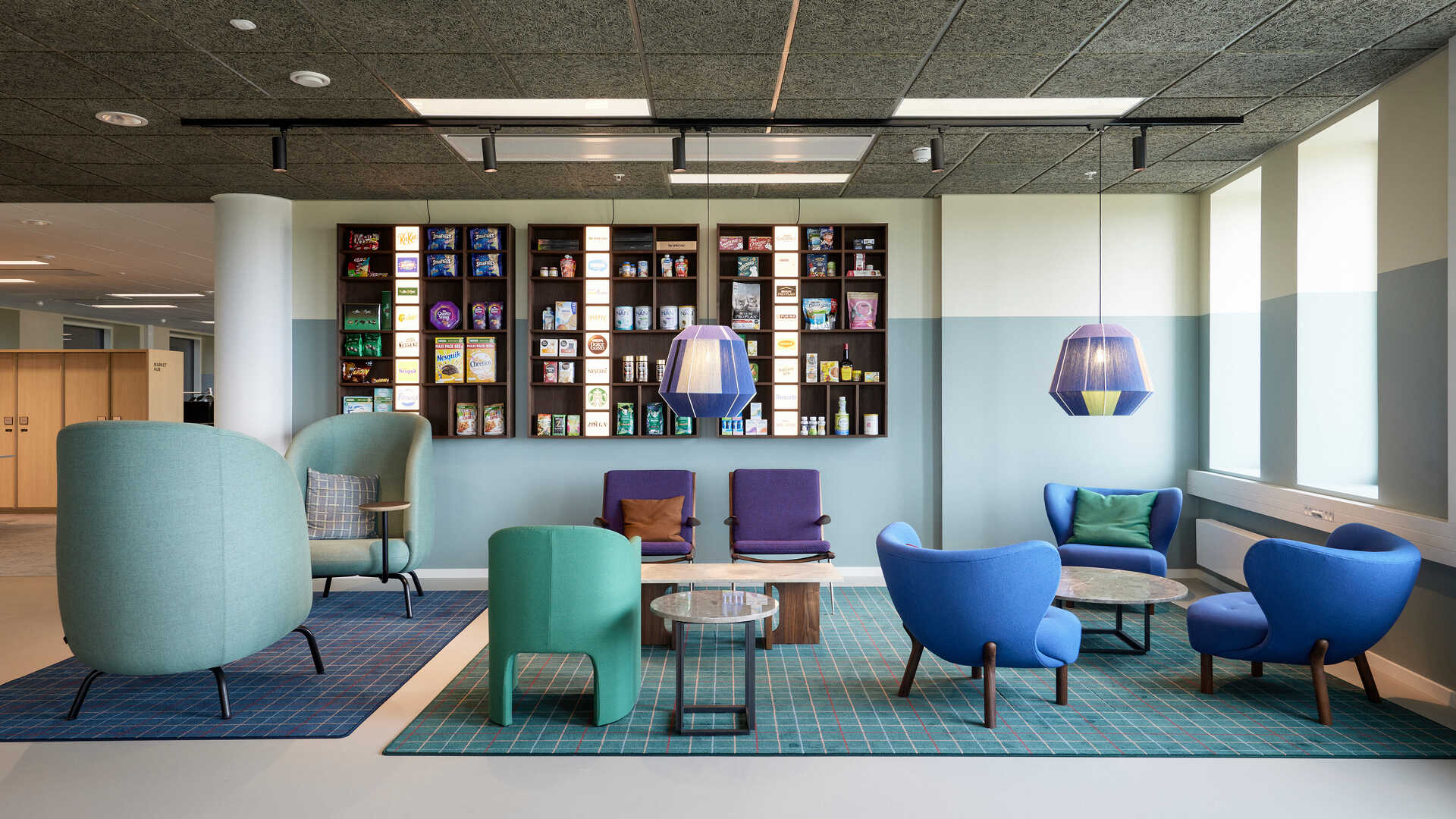
Interior design by Laura Scheuer Trøstrup, The Sweet Spot & Maria Juul Løhde, WINK
Photos by Bjarni Berghamar Jacobsen & PressConnect
Nestlé is neither one colour, one brand or one product – it's a feeling! With this powerful statement, interior designer Laura Scheuer Trøstrup, spatial designer mDD Maria Juul Løhde and Nordic transformation manager at Nestlé Anna Bergvall embraced the challenge of telling the story of one of the world's largest food companies through a cosy corporate office interior design.
Naturally, Nestlé is both a brand embracing multiple sub-brands and virtually all colours imaginable due to the incredibly many products owned by the Swiss conglomerate. And with such an extensive assortment and thus a brand in constant motion, the creative talents joined forces to capture and materialise the true Nestlé feeling at the new Nestlé Nordic headquarters in Copenhagen, Denmark.
Read on to learn how the approximately 4,000 square meters were decorated into a versatile space embracing all the needs and wishes of a global company with more than 100 brands and equally multifarious employees.
Structuring the creative concept of the new Nestlé Nordic headquarters around the most dominant trends within contemporary office interior design, Laura Scheuer Trøstrup and Maria Juul Løhde followed these six trends:
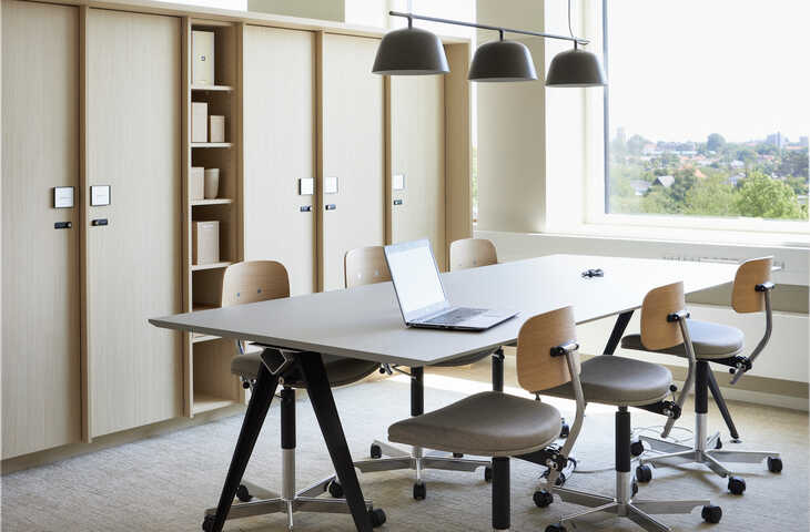
One colleague might be sitting on an inviting arrangement of soft and colourful cushions in the windowsill either typing or doing research on the laptop. Nearby, smaller teams are huddled in clusters in a bright Nordic space surrounded by modular and moveable cabinets.
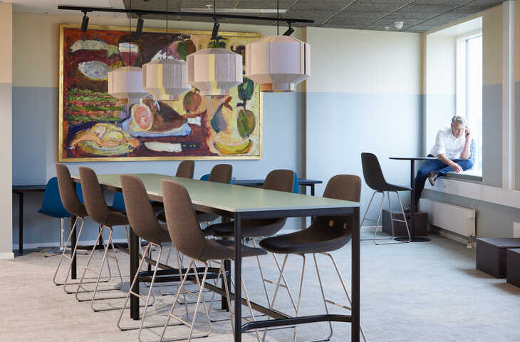
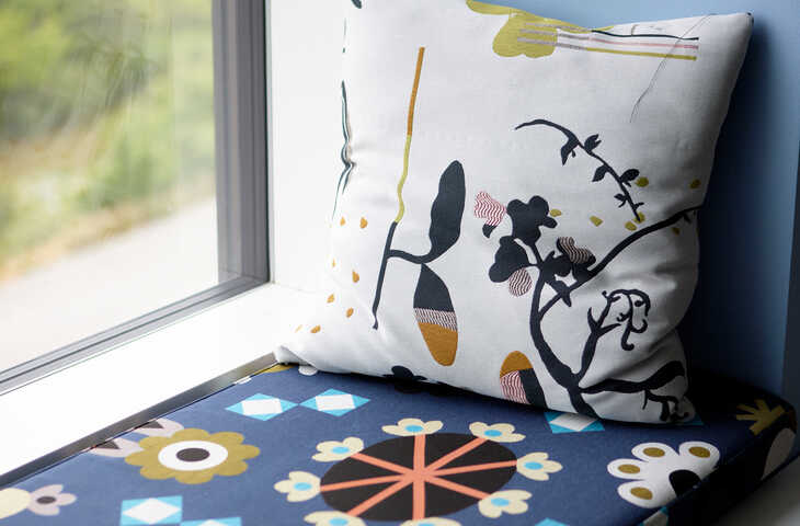
The employees can work from all seating areas including the windowsills. This concept has become so popular that Nestlé has requested even more cushions to meet the employees' wishes.
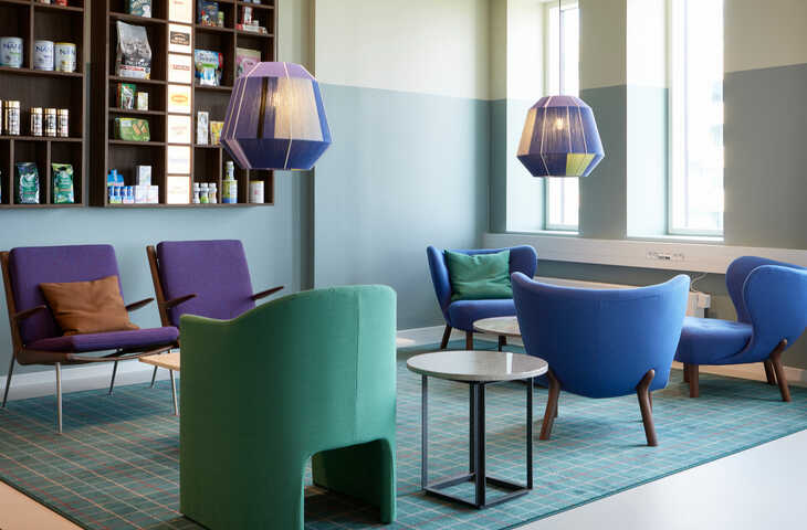
And meanwhile, colleagues from various Nestlé brands are small talking and drinking morning coffee in the large lounge area featuring a lavishly equipped café and coffee kitchen surrounded by lush plants in wooden crates as well as candy-coloured blue, purple and green furniture.
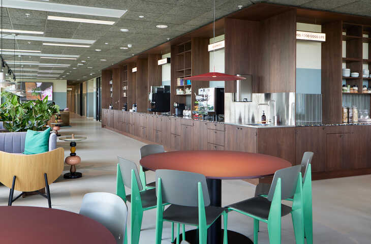
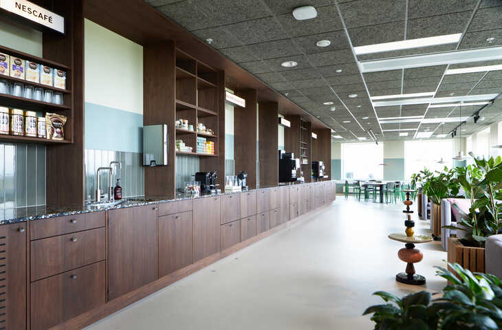
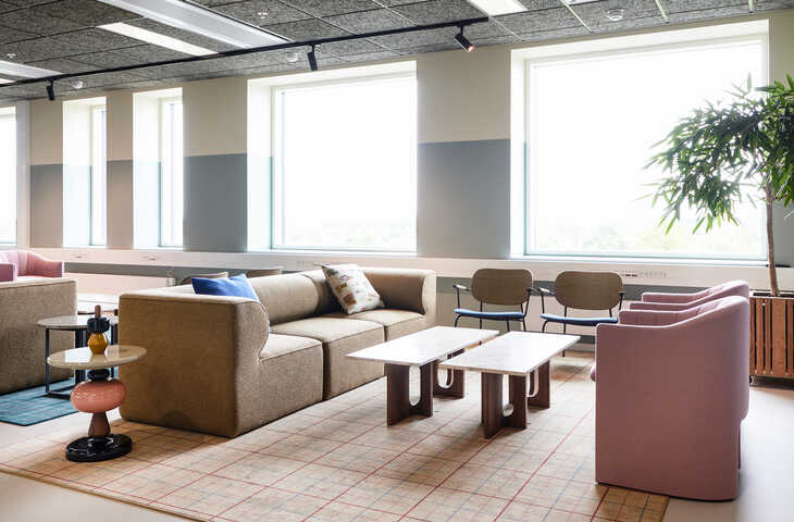
To create a workspace the employees want to come to rather than must come to, the new Nestlé Nordic headquarters combine contemporary hotel lounge ambiences with subtle interior details, playful wow elements and recognisable brand references. The harmonious balance between homely and professional references demonstrates how the creative team has managed to turn design into a game changer far beyond the immediate functional and visual features.
At Nestlé, guests and employees don’t enter a classic reception. Inspired by modern boutique hotels, the open welcome area is a more personal invitation to explore the beautiful space.
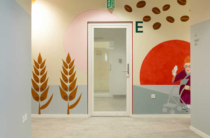
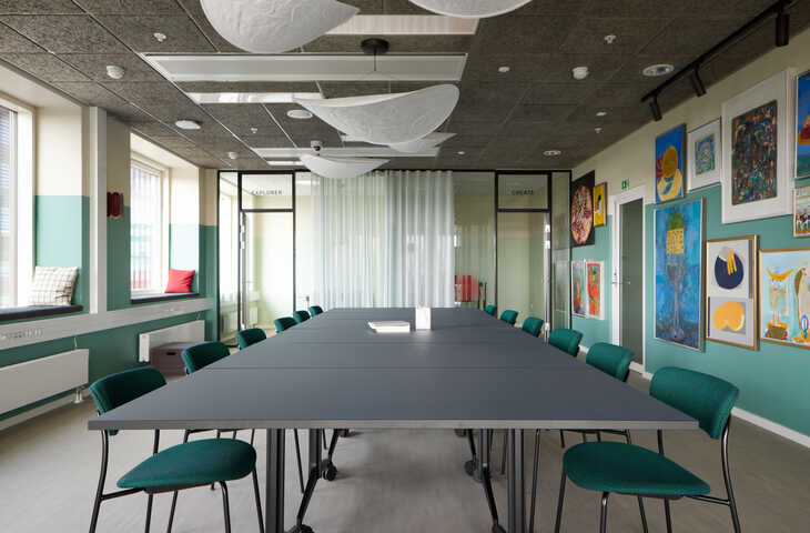
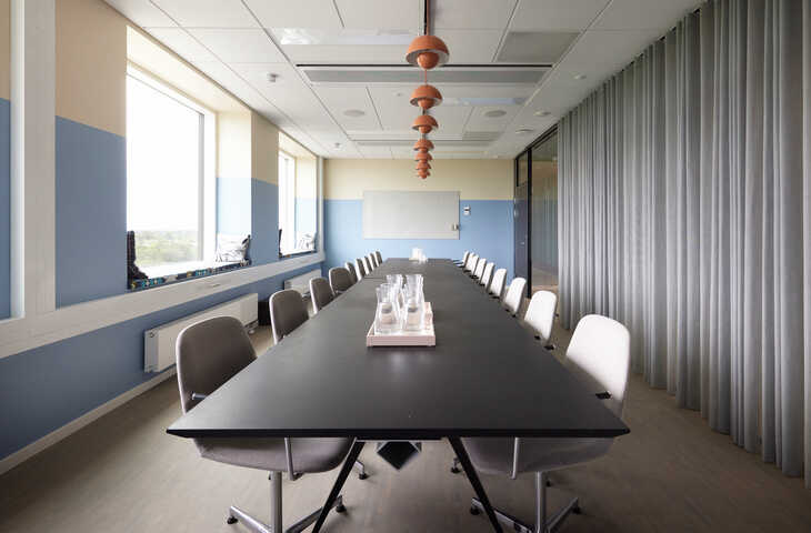
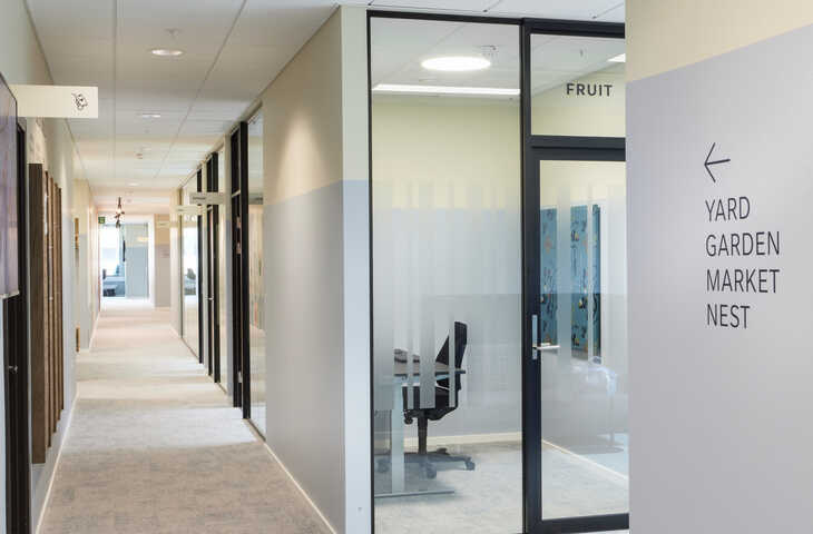
The new headquarters are arranged with spaces that can be used in multiple ways and that can easily be reduced or expanded to fit new purposes. The need for multifunctionality has been incorporated into the office plan through the large lounge area with a coffee kitchen and large office area hubs, meeting rooms of different sizes, small phone booths fitted with glass walls and curtains for privacy, numerous in-between areas where you can settle down in a soft chair to work and various special rooms that offer multiple functions as well.
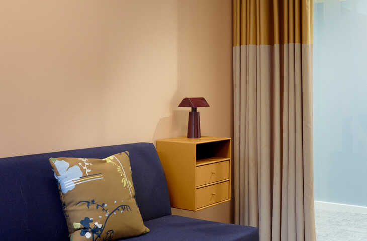
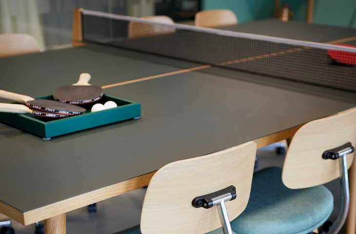
In addition, furniture of all sizes and functions can easily be moved, stacked or folded together with the purpose of creating new spaces in practically no time. In another room, meetings can take place at a removable table tennis table effectively embracing the various natures of meetings ranging from spontaneous discussions or brainstorming sessions to creative workshops.
The interplay or even tension that arises between new and old is incredibly important when transferring the soul of a company from old to new premises. Therefore, what the creative team refers to as "timely recycling of furniture" is an extremely important aspect meaning that as much as 60% of the furniture from the previous Nestlé office has been incorporated into the new interior design concept.
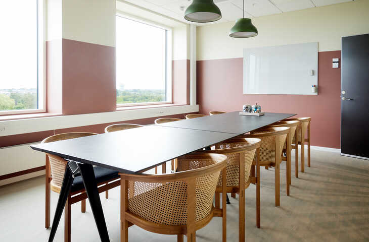
Among other things, many desks and chairs have been reused, including a selection of 15 to 20-year-old wooden chairs with fine woven details created by a renowned Danish furniture designer. These chairs are kept because they're comfortable to sit in and for their durability and fine craftsmanship. They also make a subtle link between old and new while being nice reminders of former premises and brand history.
In addition, several office armchairs and sofas have been reupholstered in blue fabric to harmonise with the new furniture.
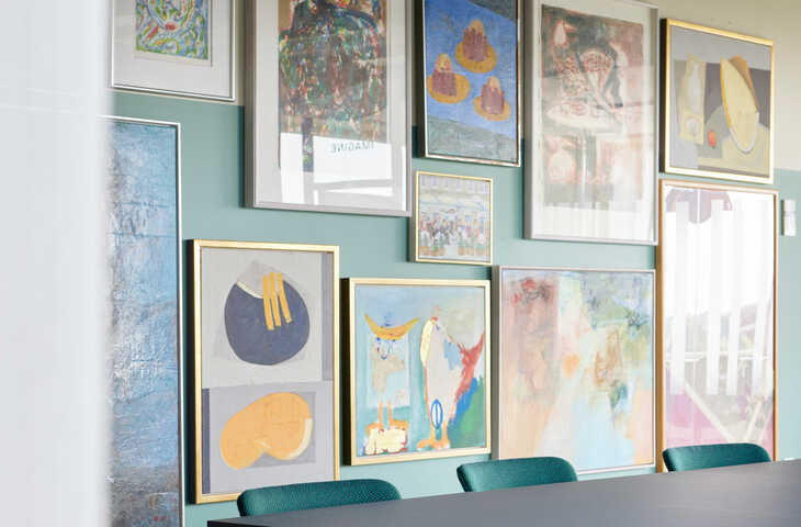
With great excitement, Laura Scheuer Trøstrup and Maria Juul Løhde have explored Nestlé's enormous collection of art and selected the best for the gallery wall that adorns one of the co-working areas.
Whether new or old, all interiors are to a high extent Danish design of good quality, and thus potentially furniture that’ll also be recycled in the future.
When it comes to ensuring personal well-being, Laura Scheuer Trøstrup and Maria Juul Løhde focus on tactility, materials and colours – and on optimising light sources, air quality and noise reduction. Here, carpet plays an important role and therefore the headquarters are both fitted with a carefully curated selection of ReForm Mark of Time carpet tiles and recoloured rugs from the Highline Express Graphic collection.
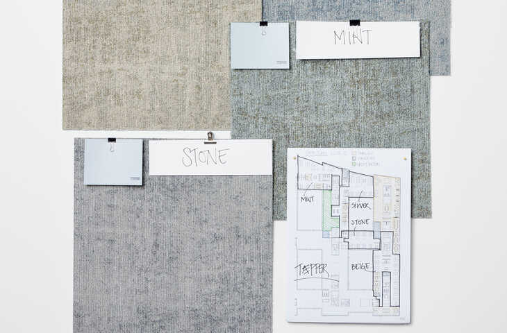
While effectively holding onto noise, carpet tiles in various toned-down Nordic colours underline when one office area ends and another begins. The soft and colourful rugs displayed earlier in this article help to create cosy zones when making a stylish underlay for groups of furniture while elegantly blending in with the colours of chairs, sofas, lamps, curtains, cushions and wall paints.
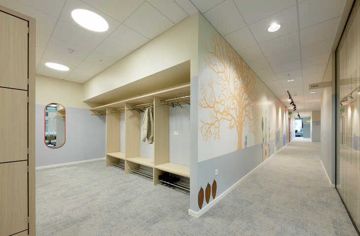
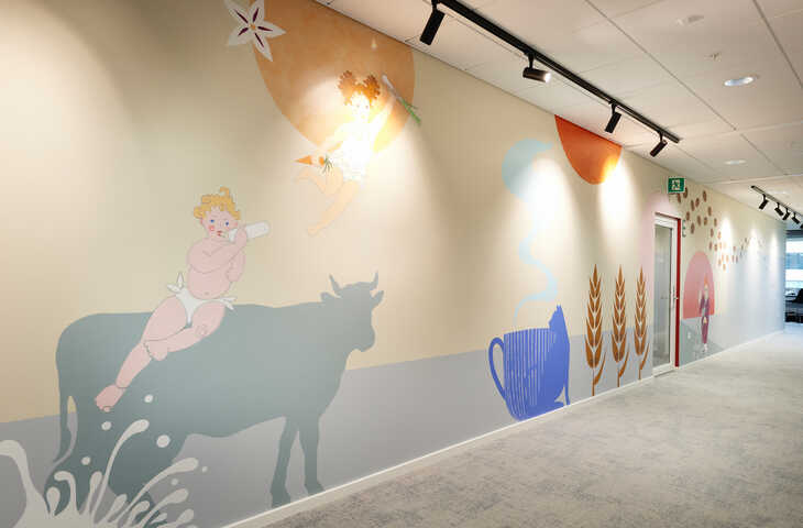
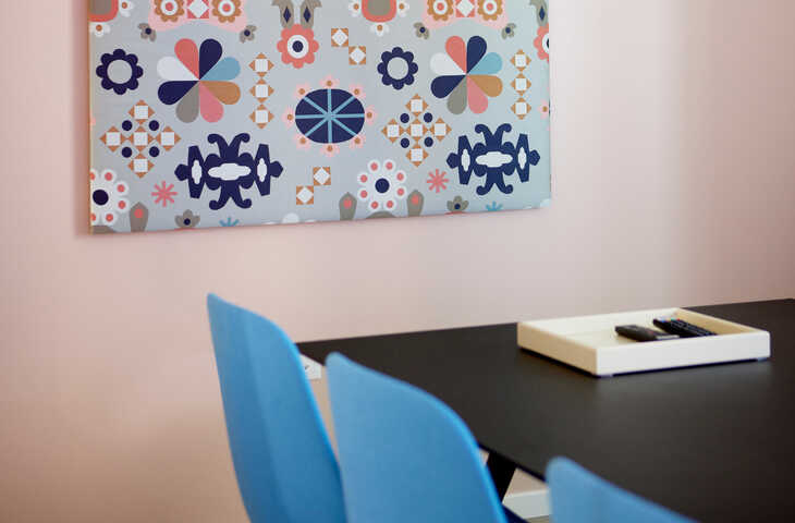
The Nestlé company spirit is expressed through a colour palette ranging from the bright Nordic classics to coffee colours, subtly hidden in textiles featuring motifs of cows, tractors and other farm life symbols that acknowledge the primary sources of many of the products.
In addition, multiple colours are brought into play in a large wall mural artistically telling the story of human life from cradle to grave and the passing of day from morning to night. The mural also illustrates the significance of the products for all phases of our lives and daily routines. The work of art is created by artists Marie Søegaard Tarpø and Christine Bechameil.
We don’t do white. Creamy colours ensure that nothing whines sharply against the nervous systems of the employees. That being said, we prefer to play with lots of colours.
Incredibly many colours are at play and therefore, they’ve been structured around a pyramid representing a kind of prioritised layer upon layer colour scale. The largest office areas are simple and clean in their expression with cabinets in light ash and carpet tiles in three grayish and beige shades. In the smaller rooms and meeting rooms, the colours are gradually turned up with soft calming blue or green walls and playful colours on lamps, chairs and art pieces.
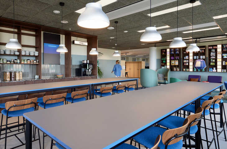
The nerve, or so-called epicentre for creativity, innovation and social interaction, is the large area with lounge furniture, café tables and a 15-meter-long coffee kitchen, where the overall corporate cosy style flows from. The creative team has truly unfolded the homely aesthetics optimised for a spontanous yet very valuable round of employee mix and mingle. Here’s plenty of dark wood, upholstered furniture, patterned cushions, checkered rugs, voluminous and organic shapes, woven lamps, art pieces on the walls, lush plants, stone and leather.
Previously, the brands and departments kept to themselves. But today, it's wonderful to see colleagues from many brands drinking morning coffee together.
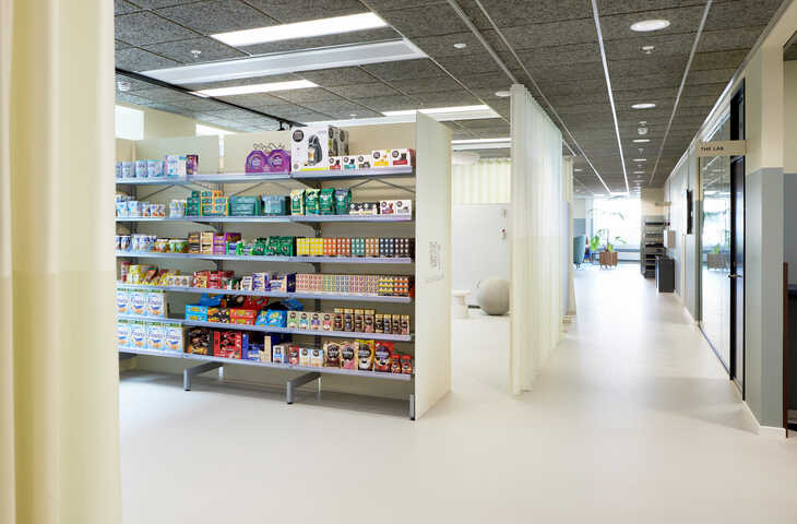
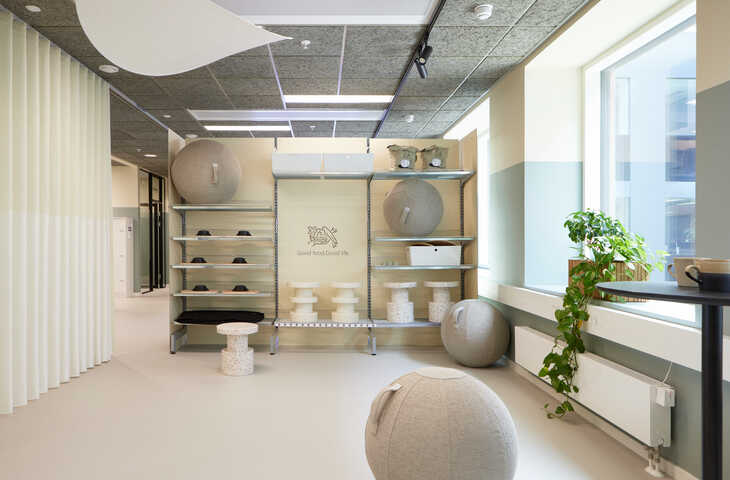
The multifunctionality of meeting rooms also reflect in the camp area, where a group of employees can start the day with yoga exercises or have an informal meeting sitting on gymnastics balls. Or another team can take over the area, which is equipped with retail shelves in light wood, to practice for a product launch.
When collaborating with Ege Carpets, your options are endless. And if you need professional advice or inspiration, we’re beyond happy to offer our support at any time.
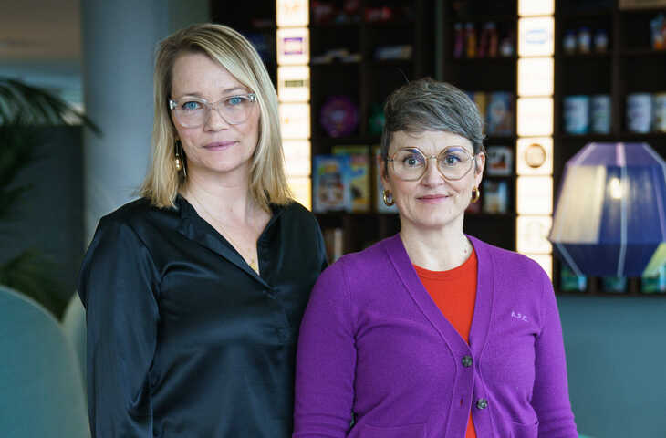
Interior designer and founder of The Sweet Spot. For the past 18 years, Laura Scheuer Trøstrup has specialised in commercial and hospitality interior design, always with an emphasis on homeliness and well-being. Laura Scheuer Trøstrup has designed a large number of salons, clinics, homes, continuation schools and has also worked with Power, People's, Nordsøfonden, SDFI, Kilroy and Nestlé, among others.
Spatial designer mDD and founder of WINK. For 20 years, Maria Juul Løhde has developed commercial interior design that offers unique spatial experiences by reflecting identity and culture from the overall lines to the smaller details. Maria Juul Løhde's projects range from large corporate interior design projects for clients such as VML MAP, Accenture Song and Nestlé to a takeaway chain, a cruise ship and most recently, she was a jury member in an international design competition by USM, ADEYAKA and Fundacío Mies van der Rohe.
Design inspiration delivered straight to you