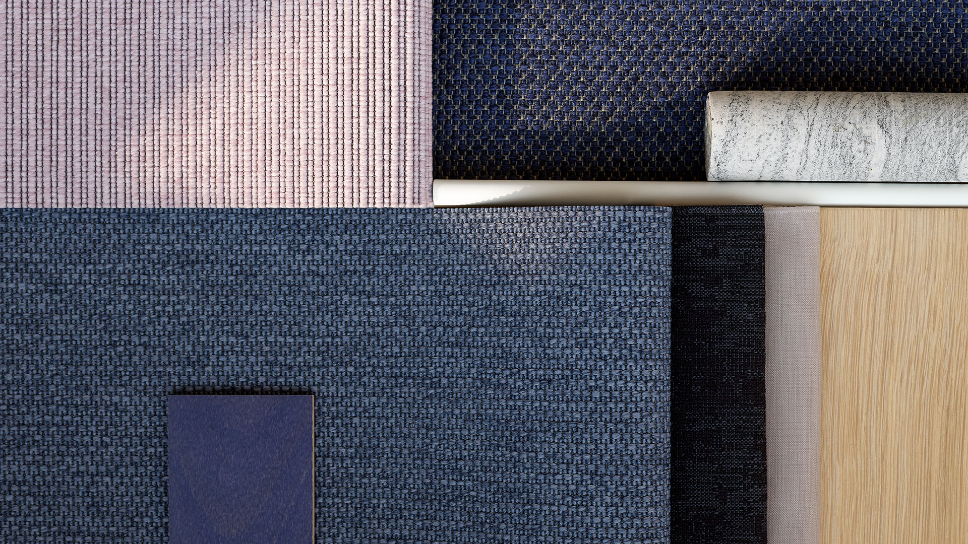
In her quest for industry’s poetry and humanity, Danish textile designer and colour alchemist Margrethe Odgaard continuously explores the interaction between colours, materials, light and space. Margrethe focuses on the colours’ different competences and to help you make use of what colours have to offer, she has developed 56 ever-relevant floor surface colours.
Before digging further into the 56 beautiful colours, let’s look down. To the floor; to the foundation for the entire room; to the surface on which we trust to find stability and security. Why? To see the floor’s potential.
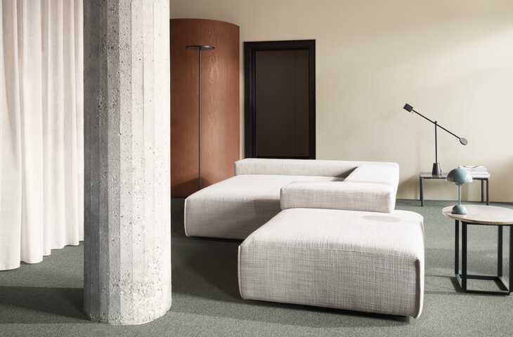
The colours of the walls are important for the energy in your room, but the floor colours also play a big role. A grey carpet discreetly underpins any wall colour, but why not use the floor’s full potential by letting the carpet occupy the space on its own terms?
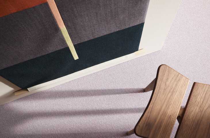
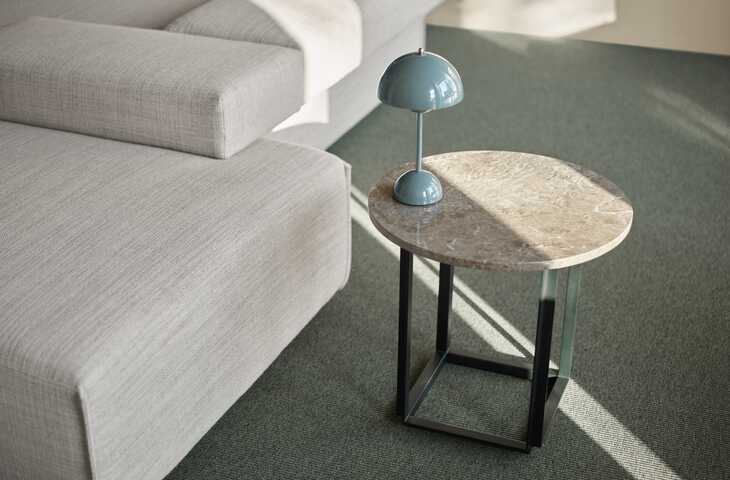
A colour isn’t just the combination of the pigments seen by the eye. In the course of the day a colour will change character as different light sources of varying strength cast fleeting shadows on the large, unbroken expanse. You may already have discovered that light moves more softly across the floor than on the wall, where the light meets the colours more directly? The carpet’s tones are also part of nuanced interactions with the other colours of your interior, and it’s all these interactions that define the room.
Colours for the floor must offer a degree of stability in the room because it’s where we set our feet. You have to trust them and feel secure when you enter the room.
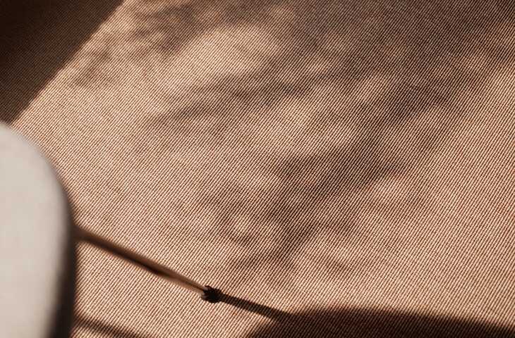
Margrethe Odgaard works with colours from an overall sensory approach and believes that interiors created with the intention of nourishing the body and soul can have a noteworthy positive effect. Her ambition is for colours to stimulate energies and create atmosphere. When you step into a room, you’ll not necessarily pay attention to the colours. The important aspect is your physical experience of your presence in the room.
In her work with colours, Margrethe focuses on the importance of their competences. In developing the 56-colour palette, she therefore created a preponderance of social colours that complement and lift each other, as well as individual diva colours that stand out clearly and add vibrant dynamics to the setting. The generous number of mineral-inspired hues makes it possible to create an infinite number of combinations in which the colours relate and react very differently to each other – on the floor and in relation to the other materials used in modern architecture.
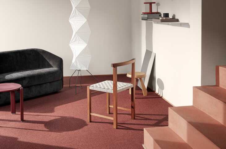
With the ambition of creating poetry in the floorscape, Margrethe wants to communicate positive emotion you can take with you. This is an emotion that you cannot necessarily identify, but which nevertheless exists and nourishes you.
The 56 colours are offered in the Compact, Pro, Rustic (including Rustic carpet tiles and planks) and Structure wall-to-wall collections that are all part of our Eco concept. An Eco style is the perfect choice when you’re looking for a carpet solution with extremely high durability and a luxurious yet understated look & feel.
Eco translates proud, classic craftsmanship into unique design and consists of several flat-woven collections in which the yarn, structure and colour choice determine the visual expression. These carpets comprise our 100% regenerated and regenerable yarn, which is made from nylon waste such as discarded fishing nets, industrial residues and used carpets.
Regenerated yarn simply means that it’s manufactured from waste products in a particular type of nylon. When yarn is regenerable this means that after use it can be converted into new nylon products. We make it easy for you and your customers to practice sustainability by specifying carpets produced with due care for people and the environment. Want to learn more about our regenerated yarn?
Margrethe Odgaard is a Danish textile designer and colour alchemist. She divides her time equally between commercial collaborations and artistic work based on her own research. Margrethe’s client book includes Kvadrat, Muuto, HAY and IKEA and she has had solo exhibitions at e.g. Willumsens Museum (DK), Röhsska Museum (SE), Designmuseo Helsinki (FI) and Munkeruphus (DK). She’s also part of the Included Middle design duo.
With this palette, I've sought to create naturally balanced colours with multiple layers below the surface.
Want to create your own poetry in the floorscape? In just a minute you can kickstart the process by ordering your very own architect folders and carpet samples - free of charge! If you need professional advice and inspiration, we're happy to offer our support at any time. So, reach out to your local consultant who's only a click or call away. We can't wait to hear from you!
Design inspiration delivered straight to you